Moab
Rebranding of a classic amongst photographers
Moab is a classic amongst photographers. A fine art and digital paper brand with a devoted following, built on decades of craft and a relentless commitment to quality. Kitchen was brought in to rebrand, not to reinvent, but to distill Moab to its truest form. To give a beloved brand the identity it deserved.
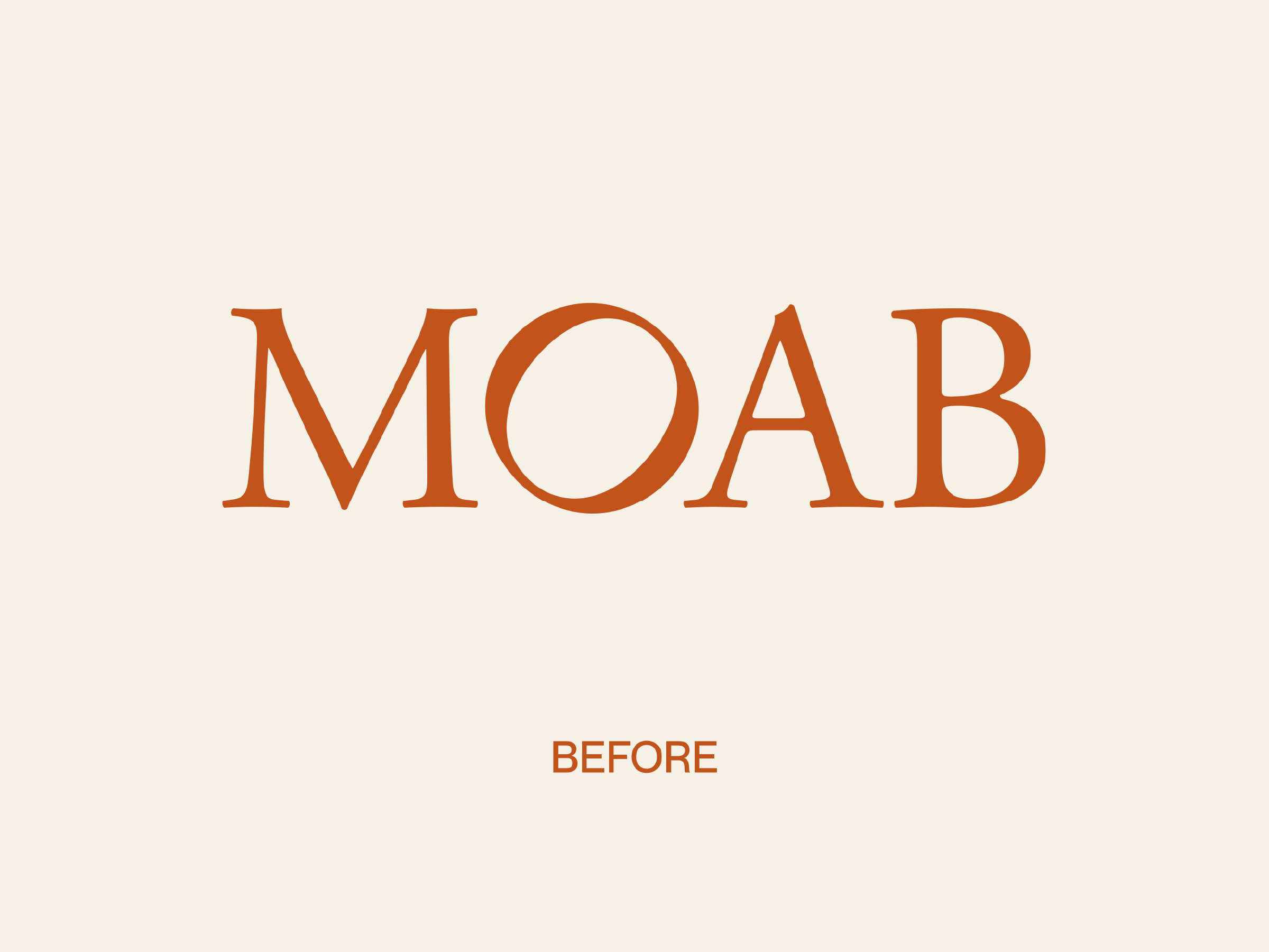
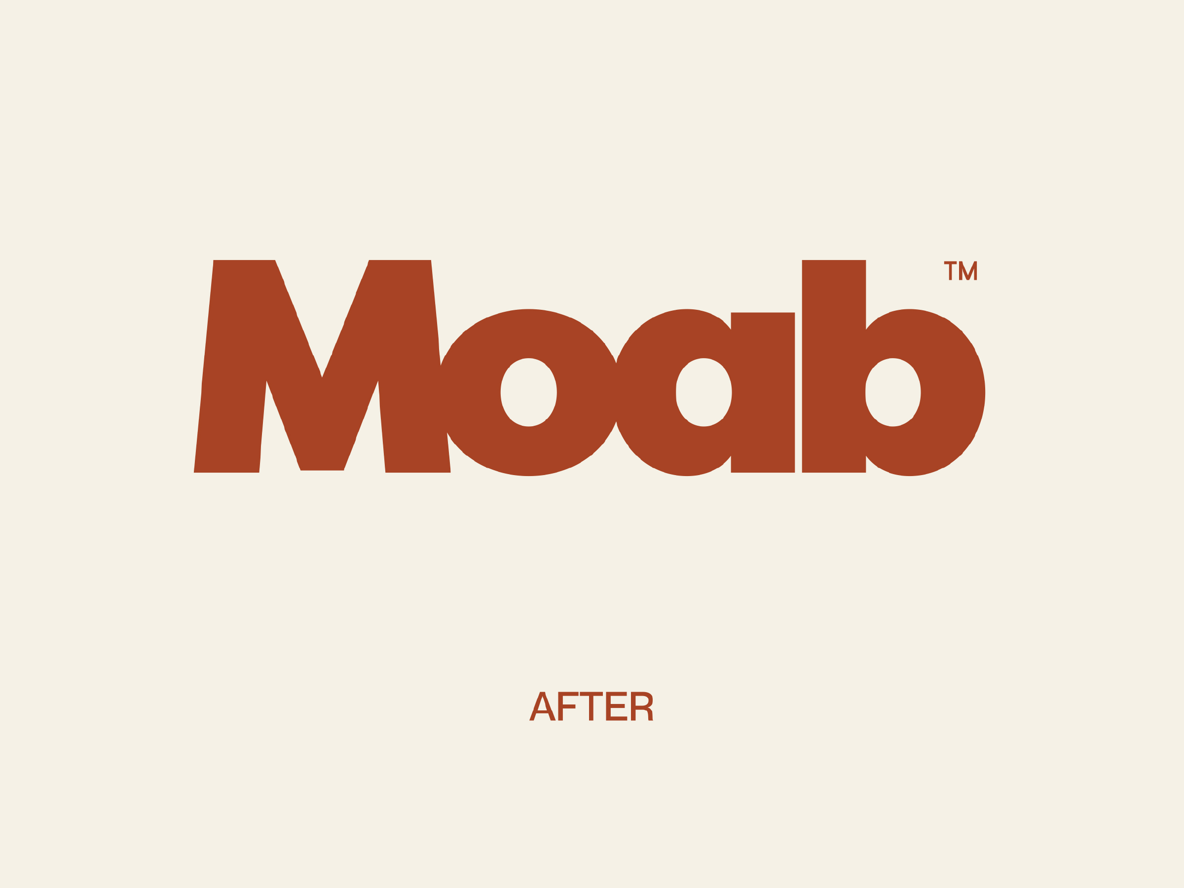
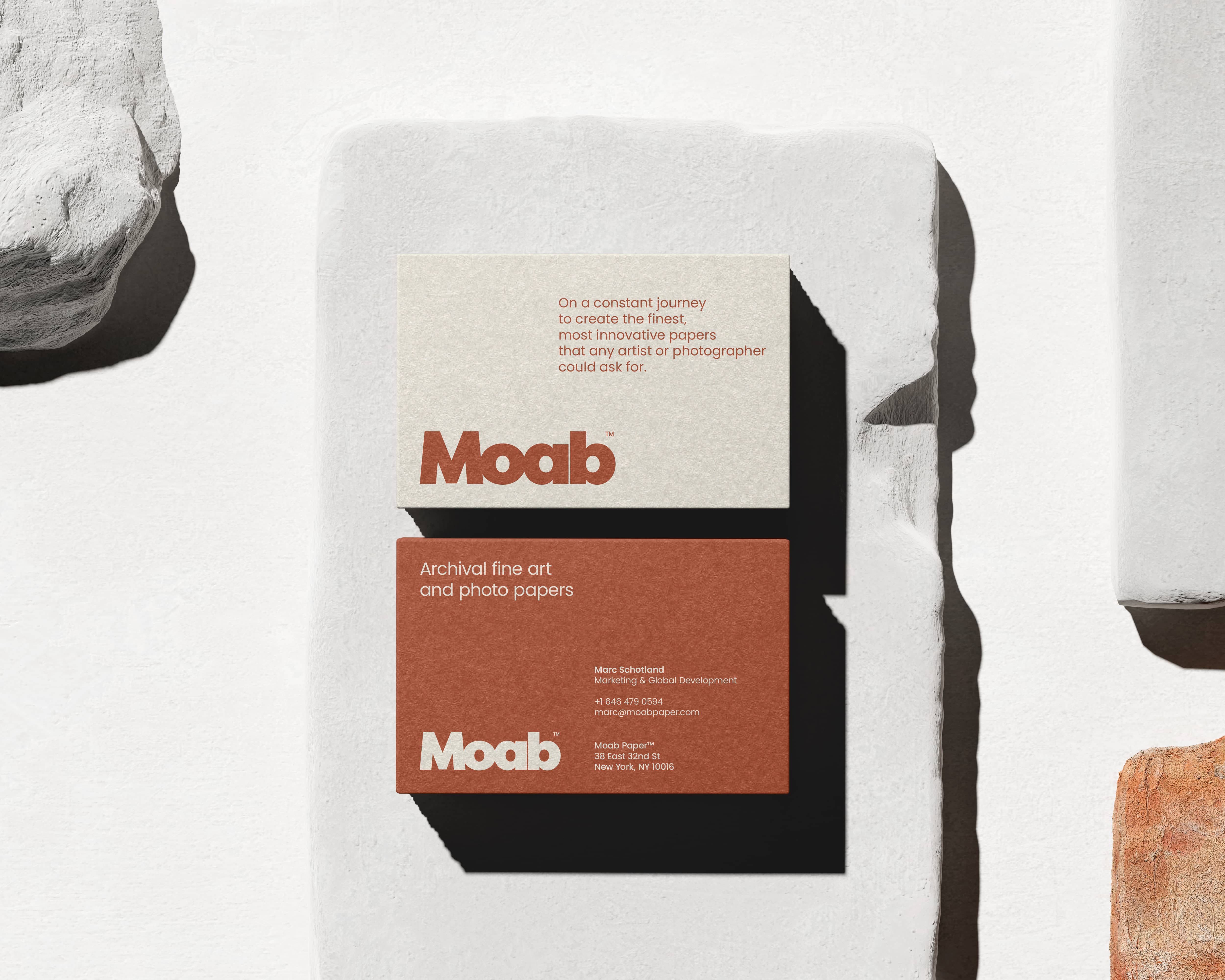
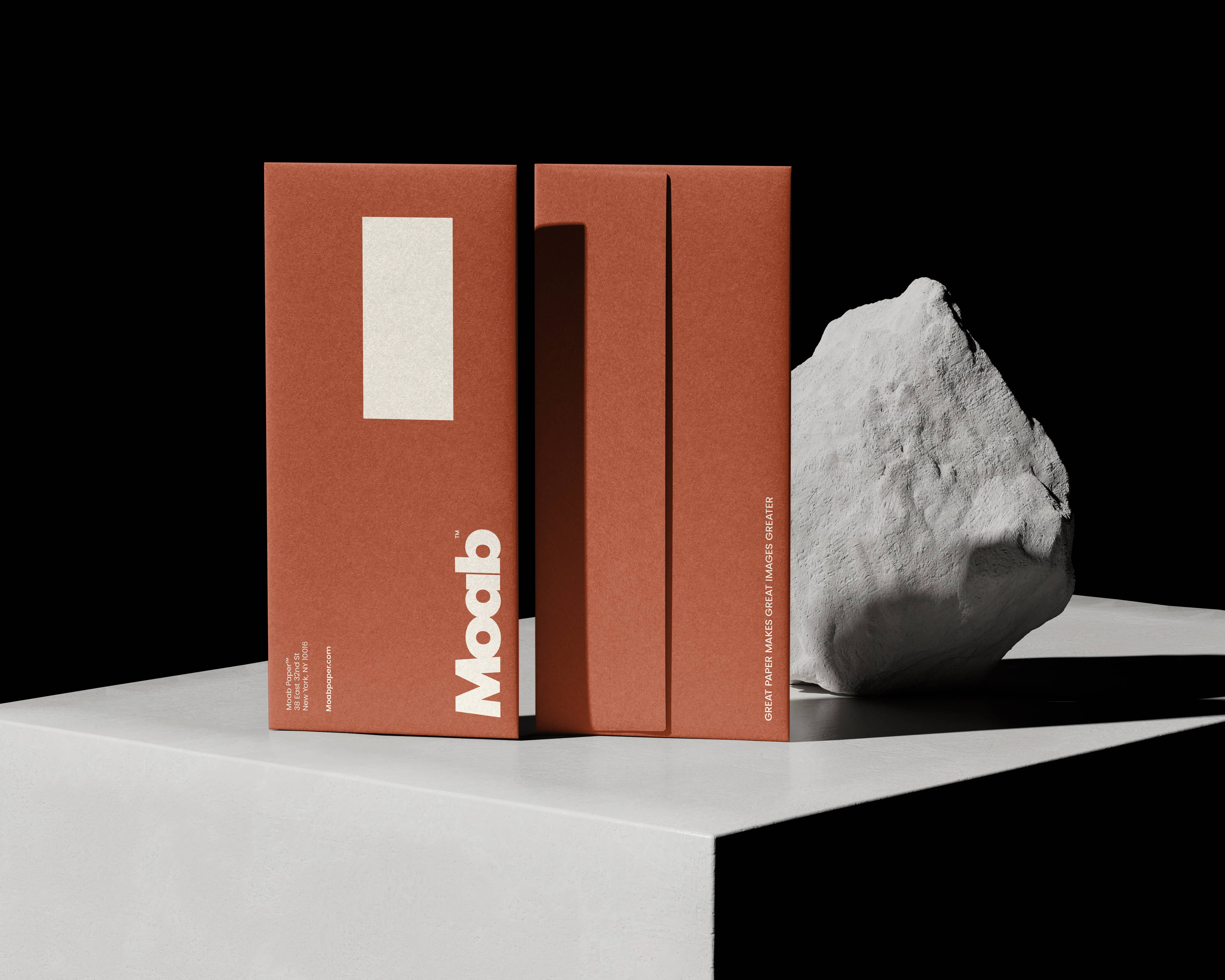
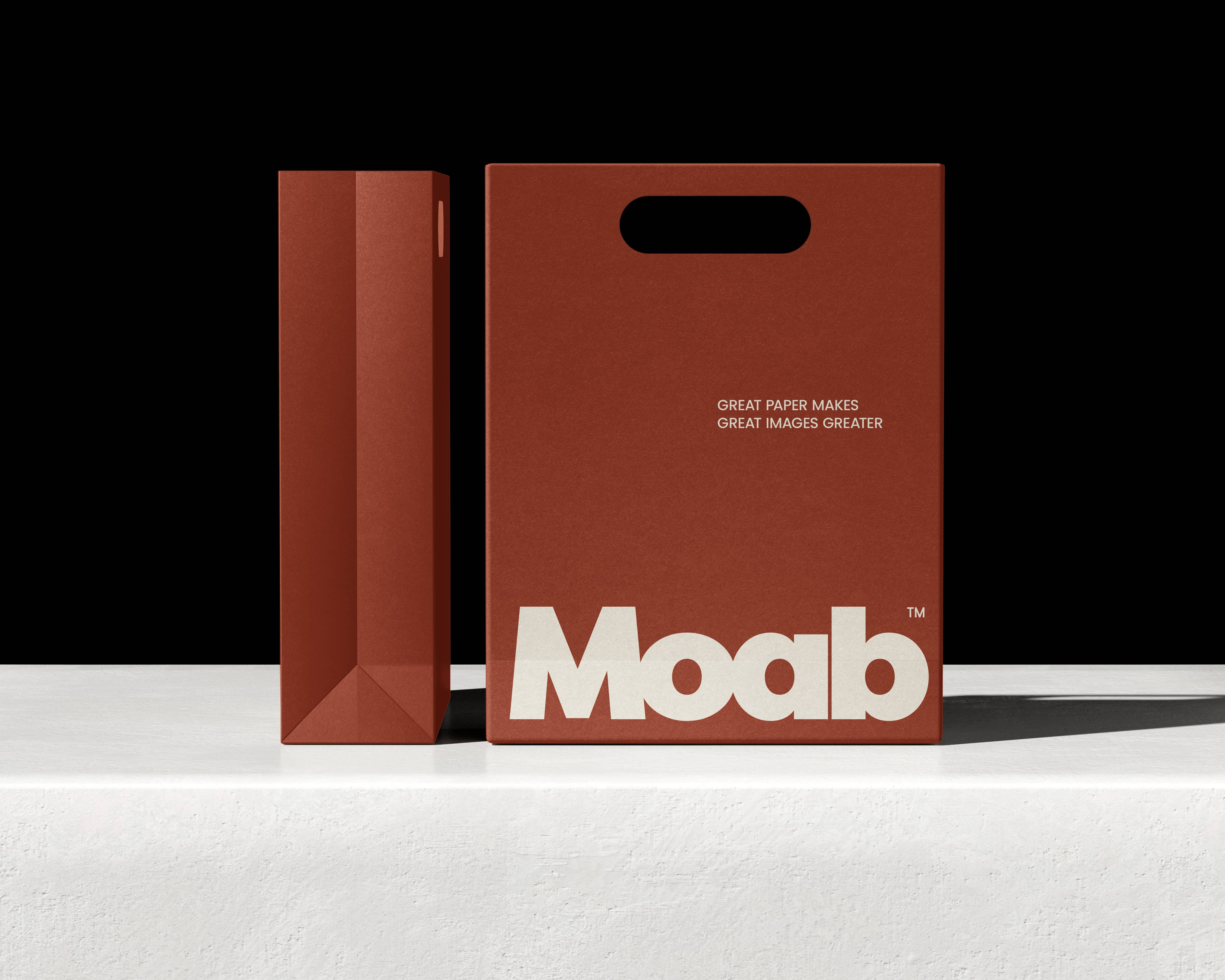
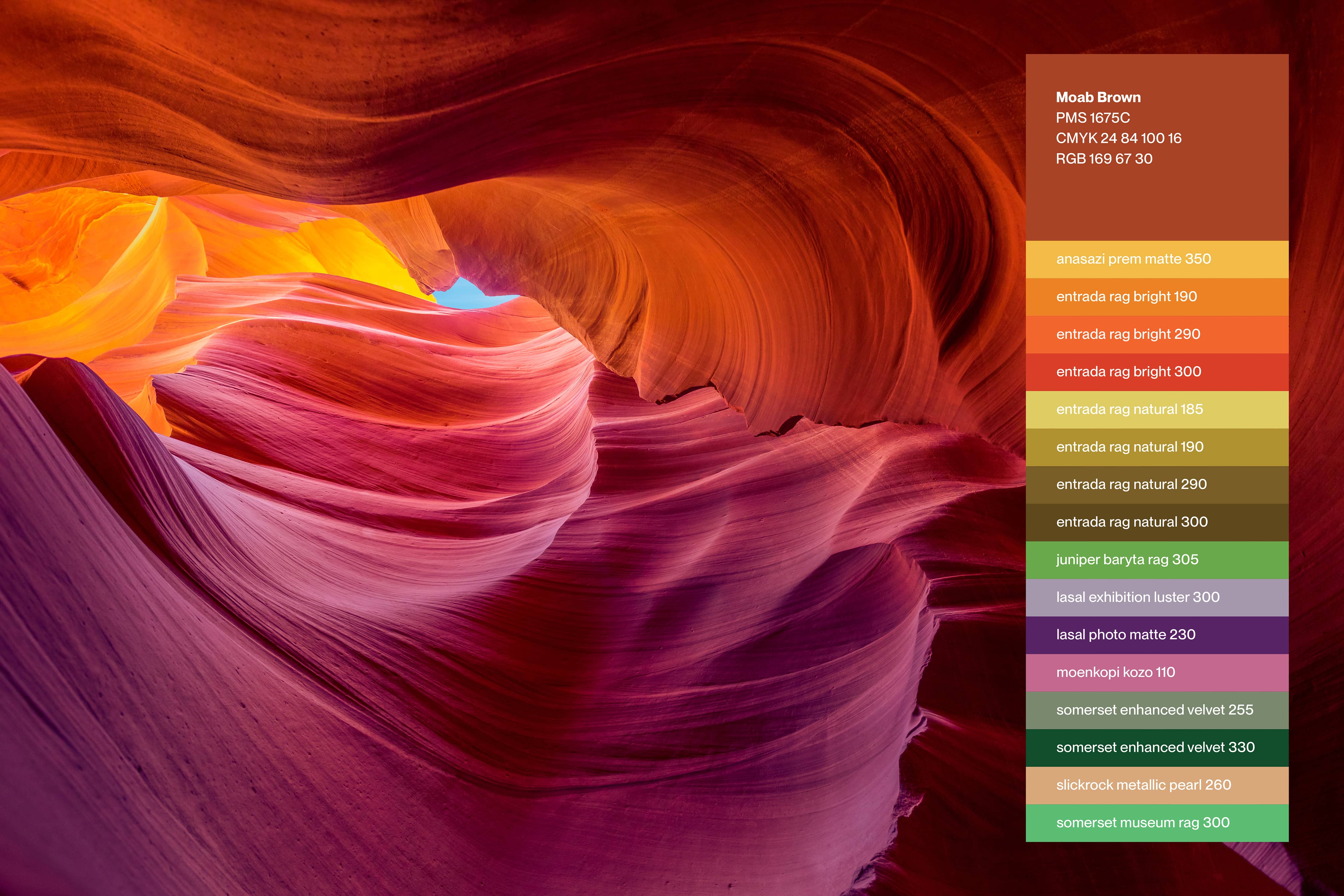
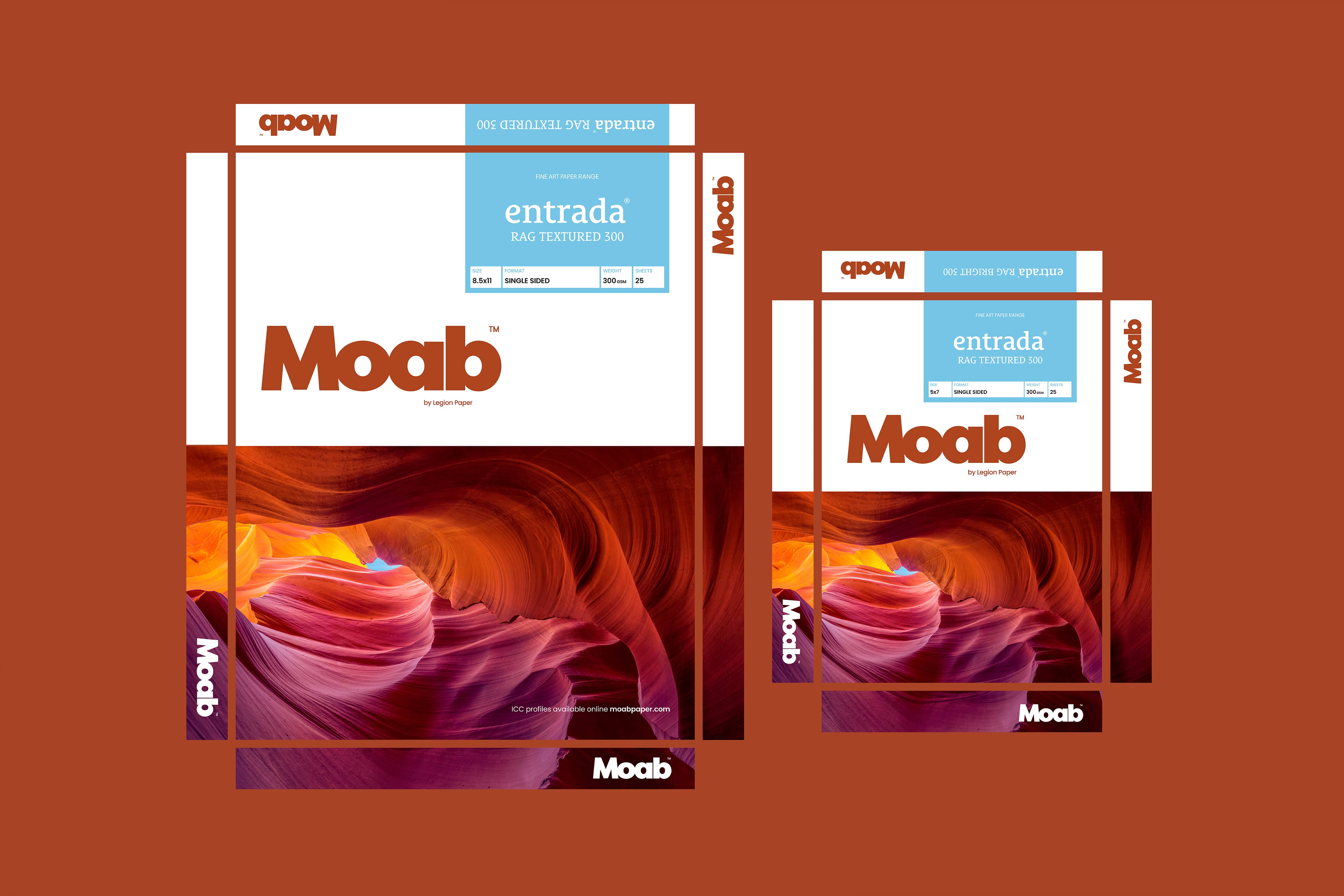
The new wordmark draws from the landscape that gives Moab its name. The red rock formations of Utah, solid, interlocking, carved by time. The typography reflects that same character: sturdy, confident, and built to endure. Not a logo that follows trends. One that looks like it has always been there.
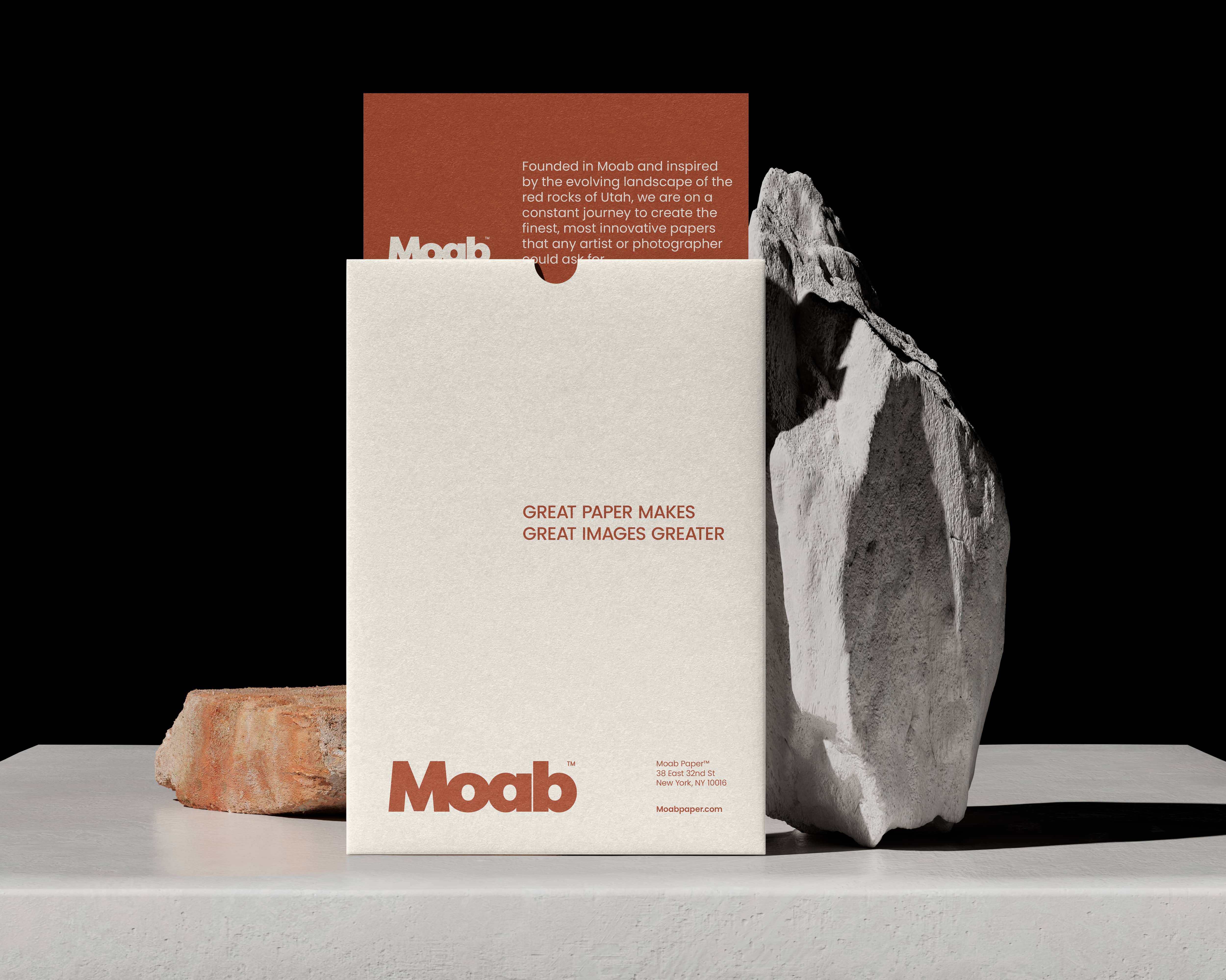
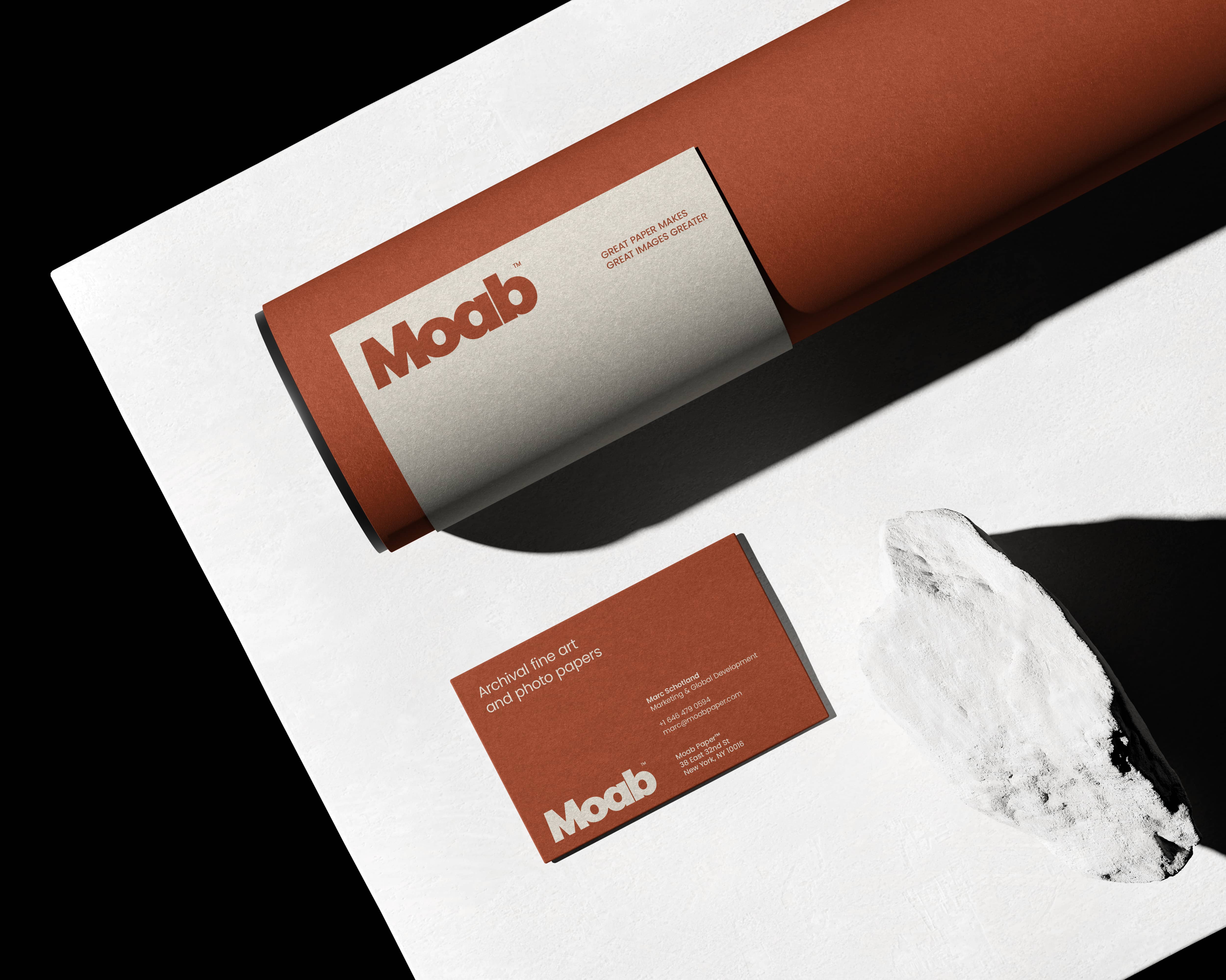
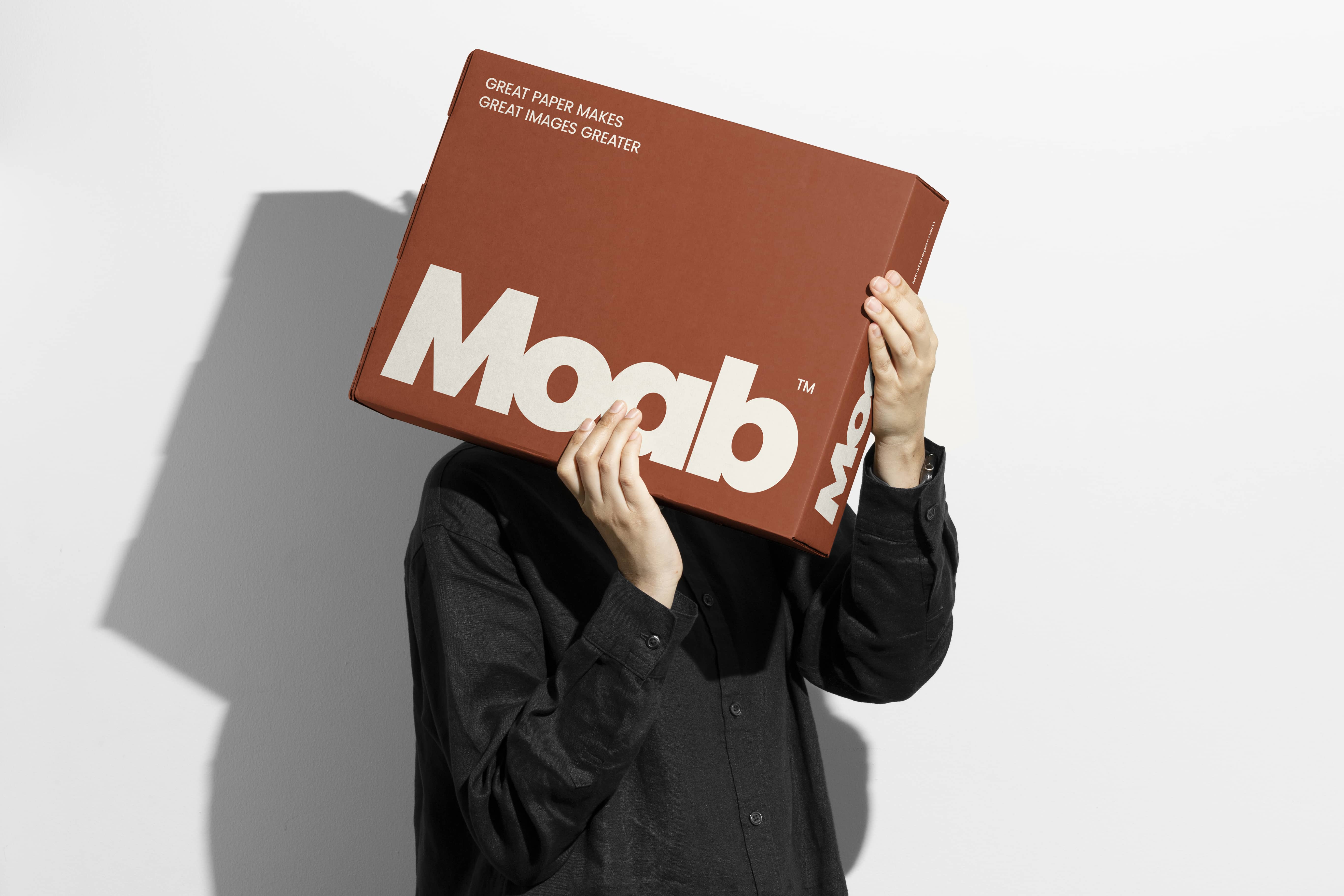
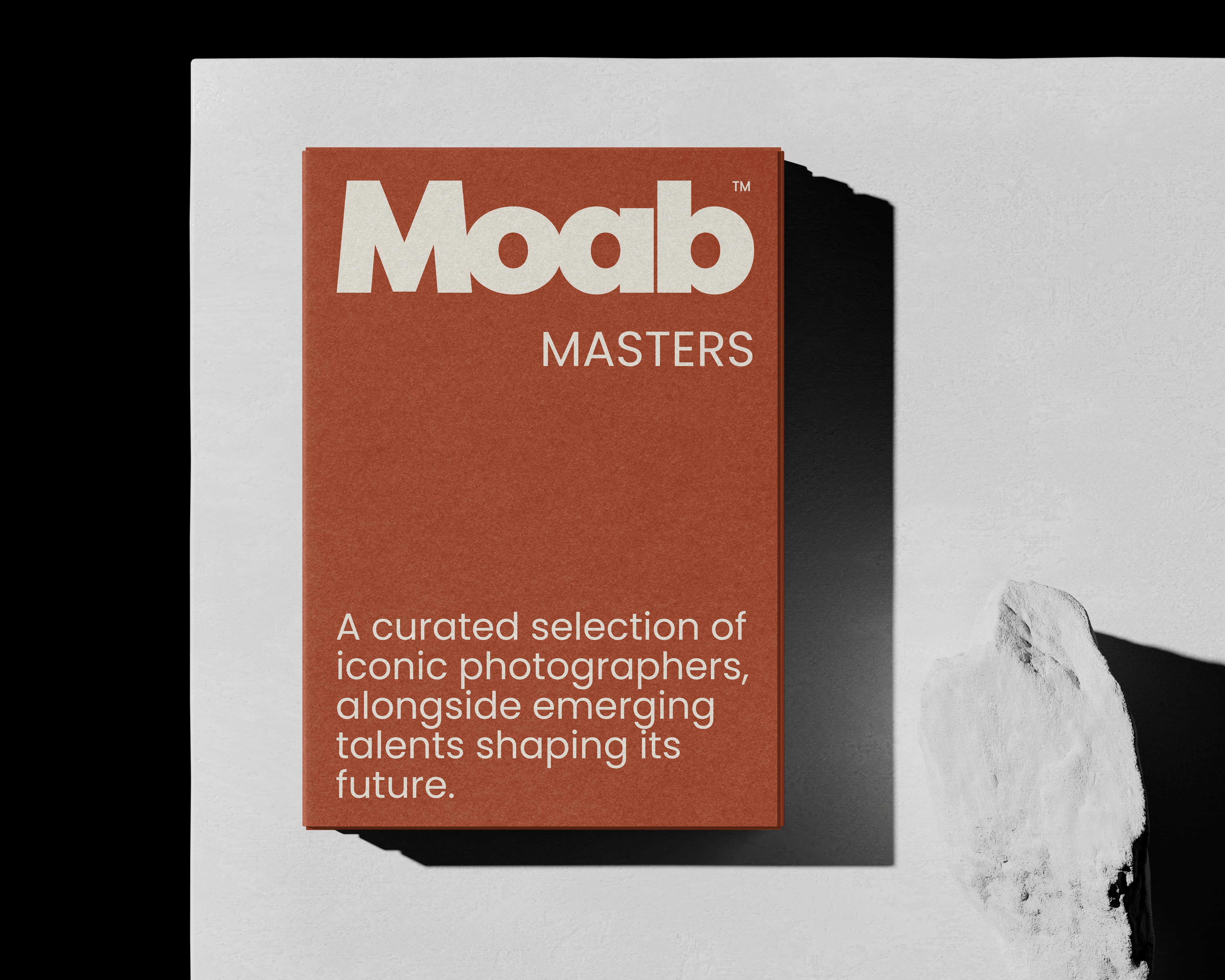
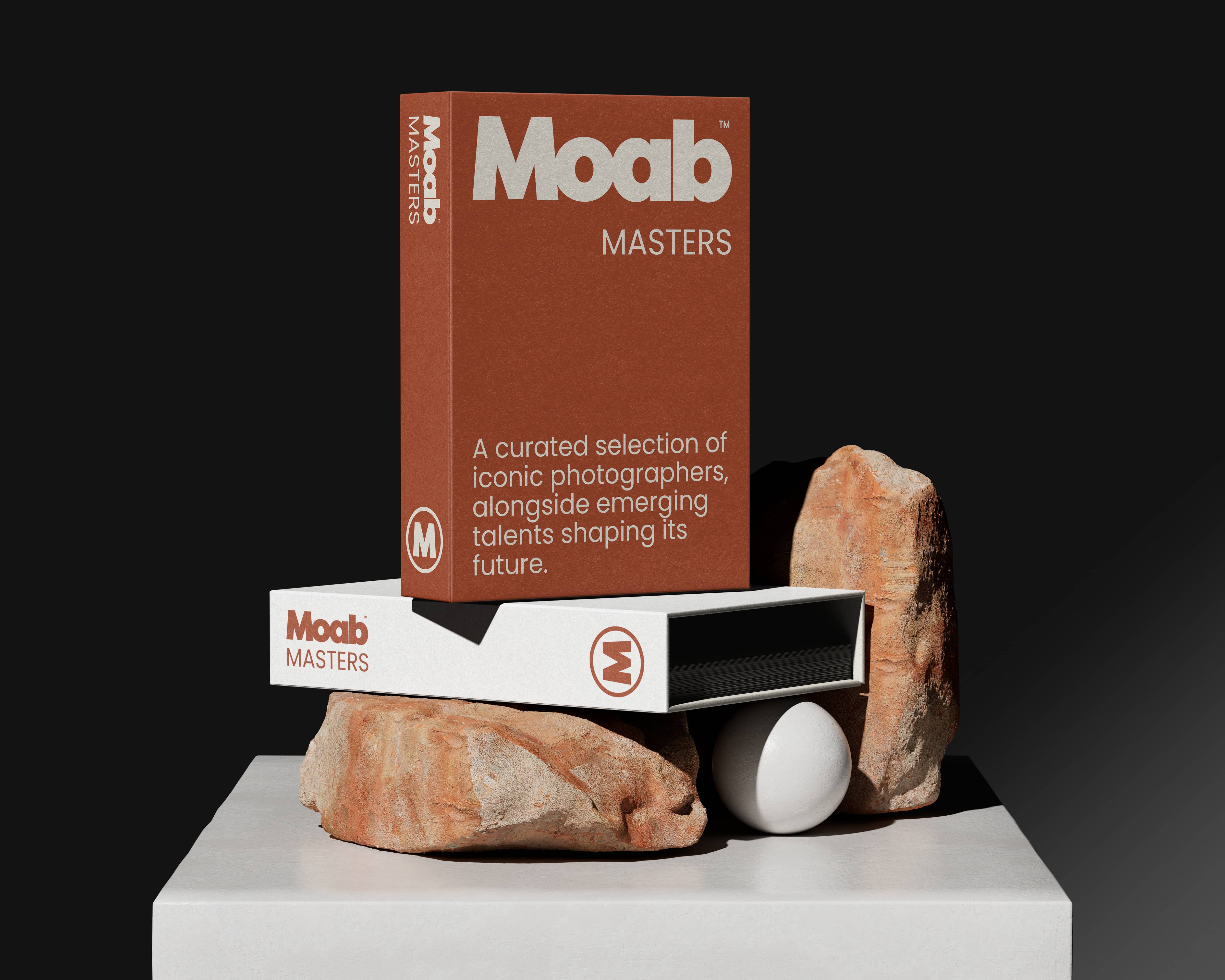
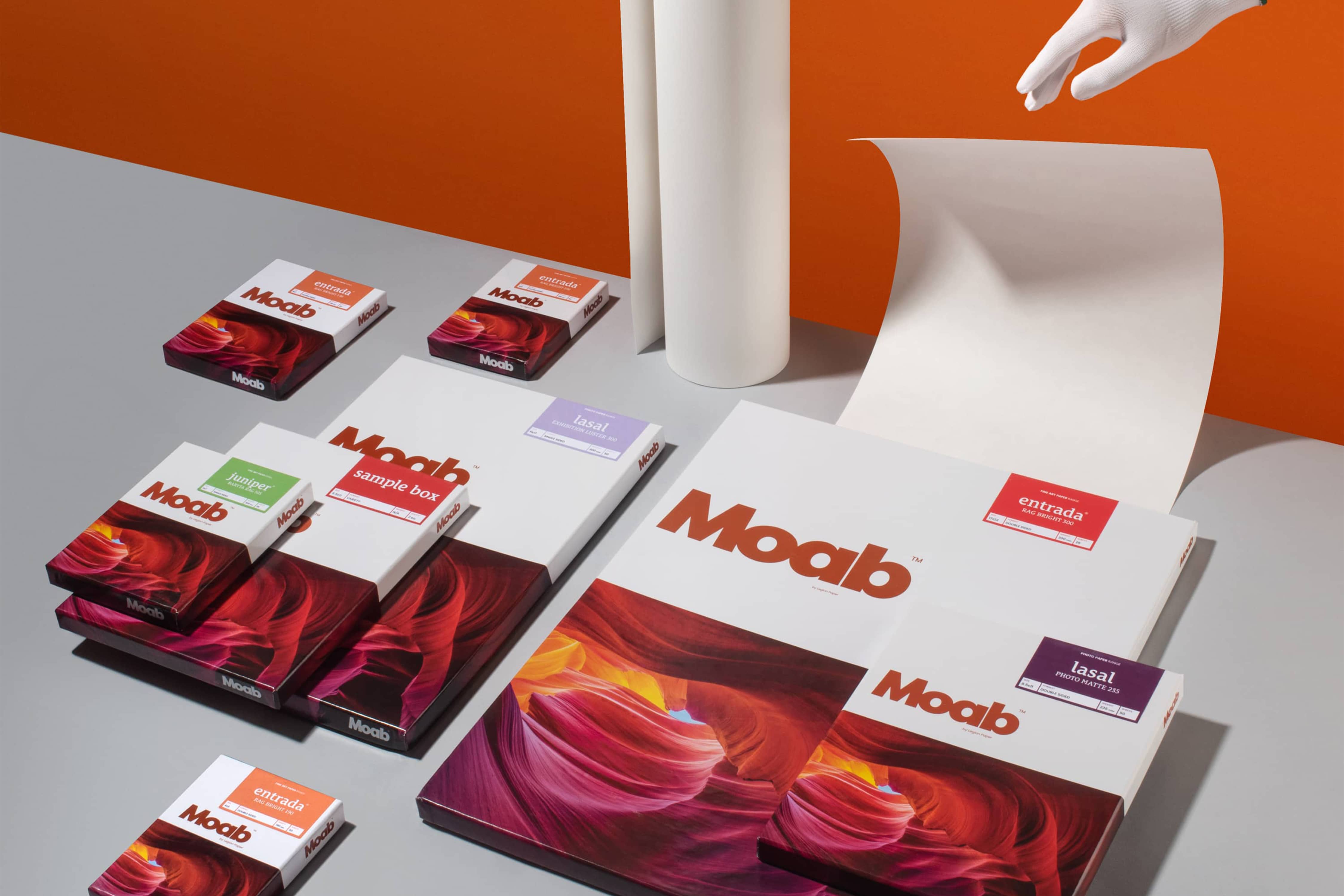
A signature color was introduced: Moab Brown. A refined red-rock tone drawn directly from the Utah canyons, anchoring the identity to its origin. The system extends across packaging, stationery and collateral, including the Moab Masters series, a curated line celebrating the world's finest photographers. Consistent, tactile, and unmistakably Moab.
For photographers, paper is not a commodity. It is the final expression of their work. Moab's new identity honors that, a brand that takes its craft as seriously as the artists who rely on it.

For photographers, paper is not a commodity. It is the final expression of their work. Moab's new identity honors that, a brand that takes its craft as seriously as the artists who rely on it.
Kitchen rebuilt Moab with precision, revealing what it always should have been. A brand that finally matches the quality of the paper.
Marc Schotland
CMO, Moab