BioFirst Group
A first expression for a global agriculture group
BioFirst Group came to Kitchen at inception. The company was stepping into a broader, more ambitious role in sustainable agriculture. Not a redesign, but a first expression. A brand built from the ground up to unite multiple companies, disciplines and divisions under one name, one vision, one future.
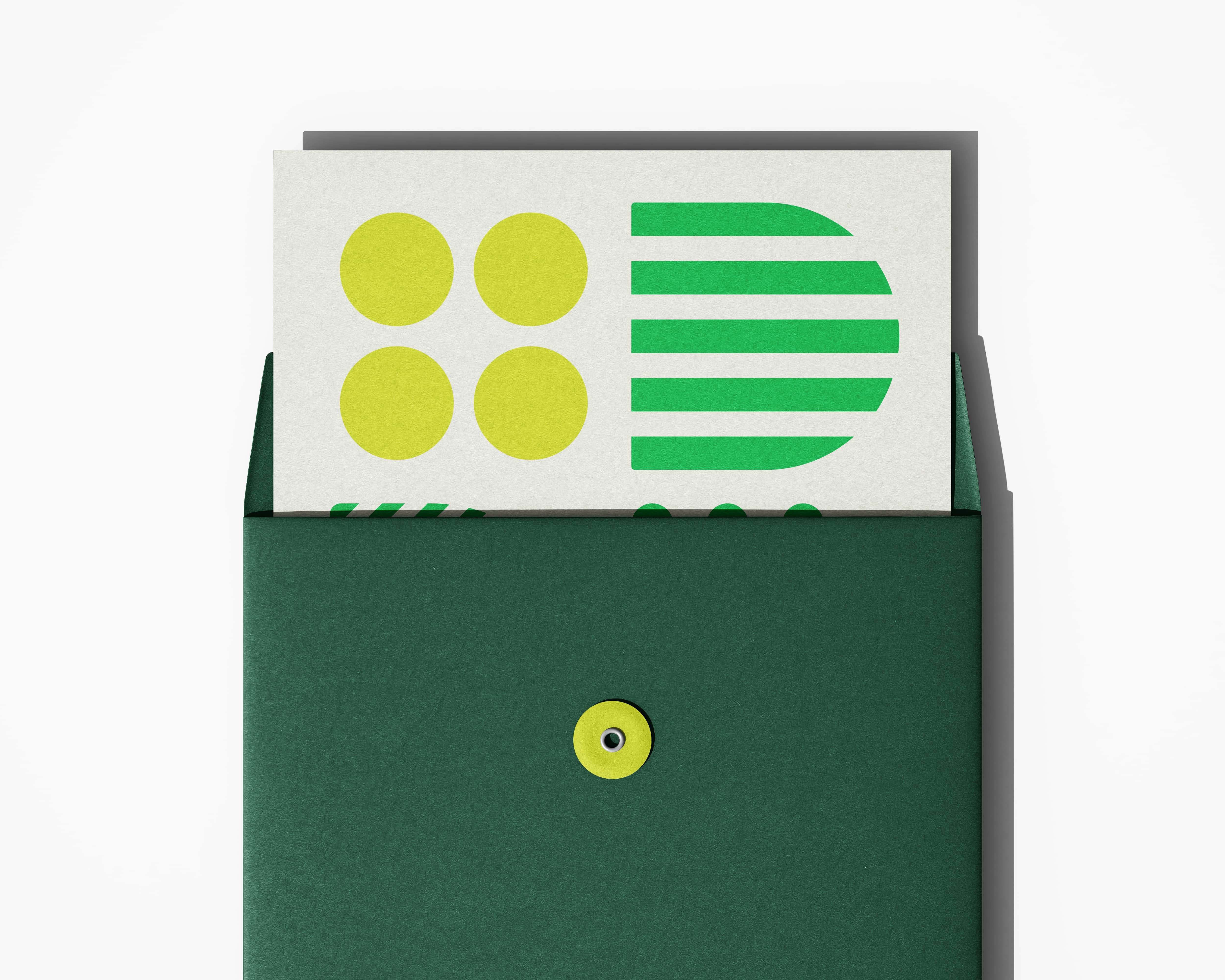
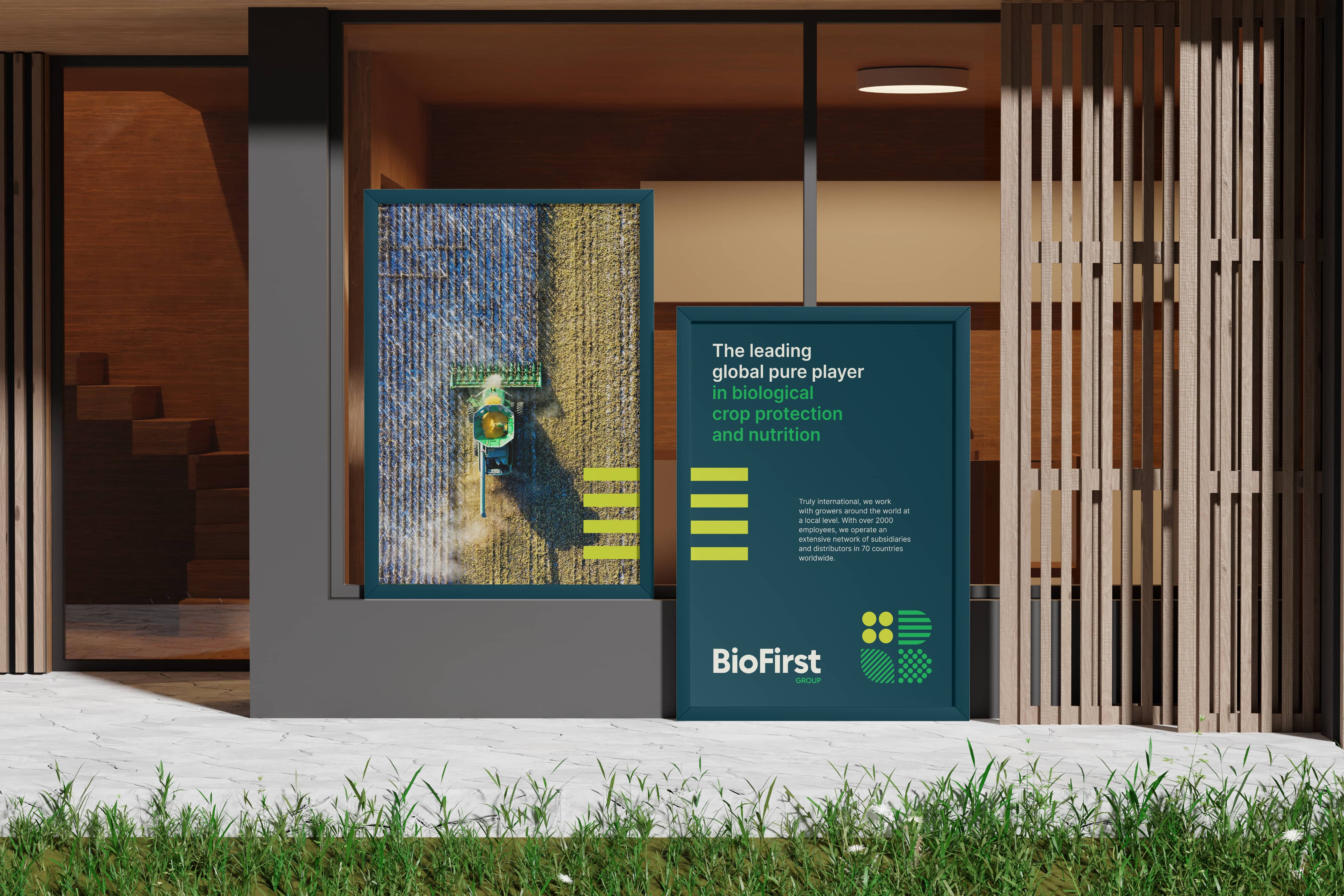
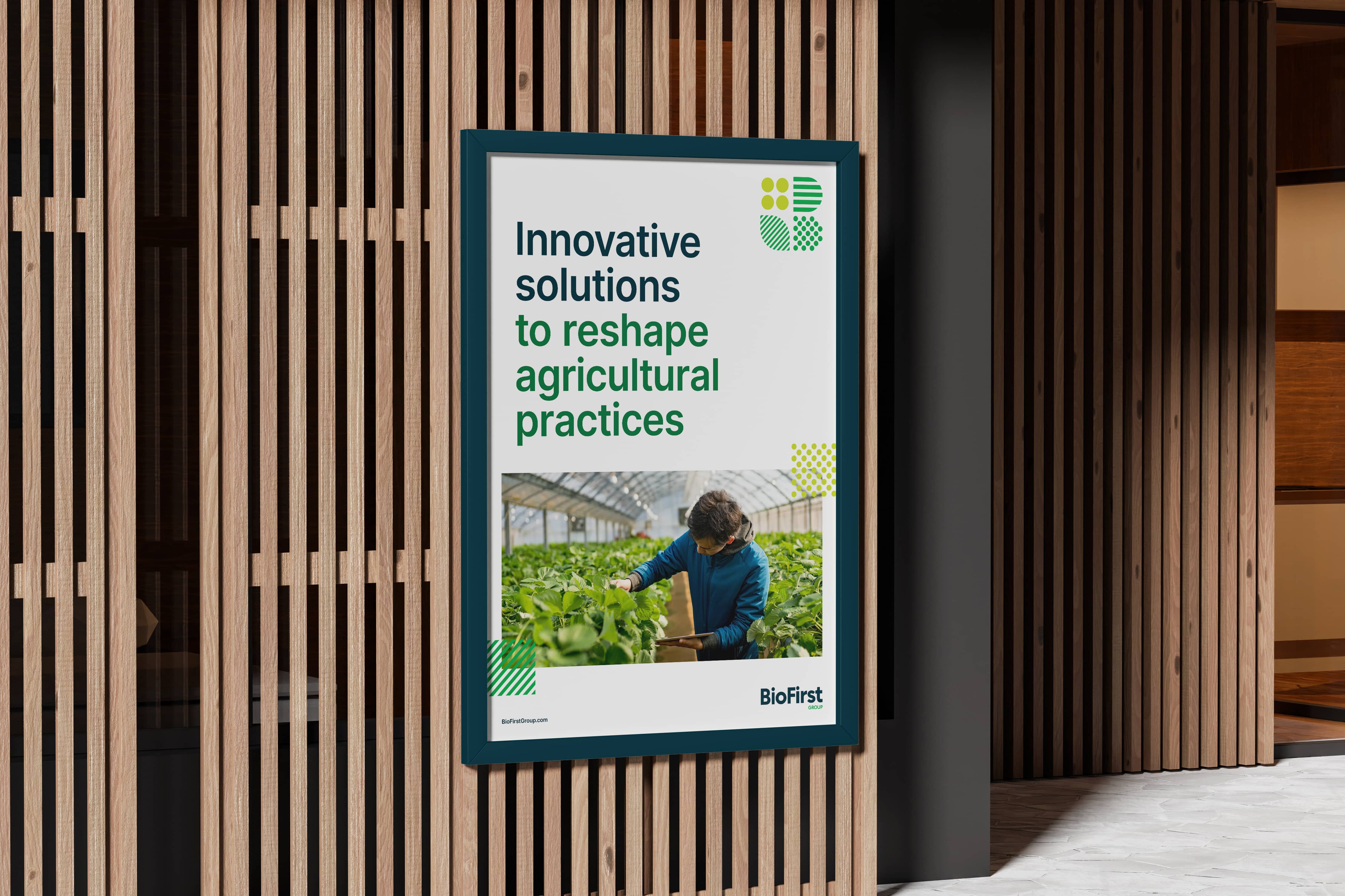
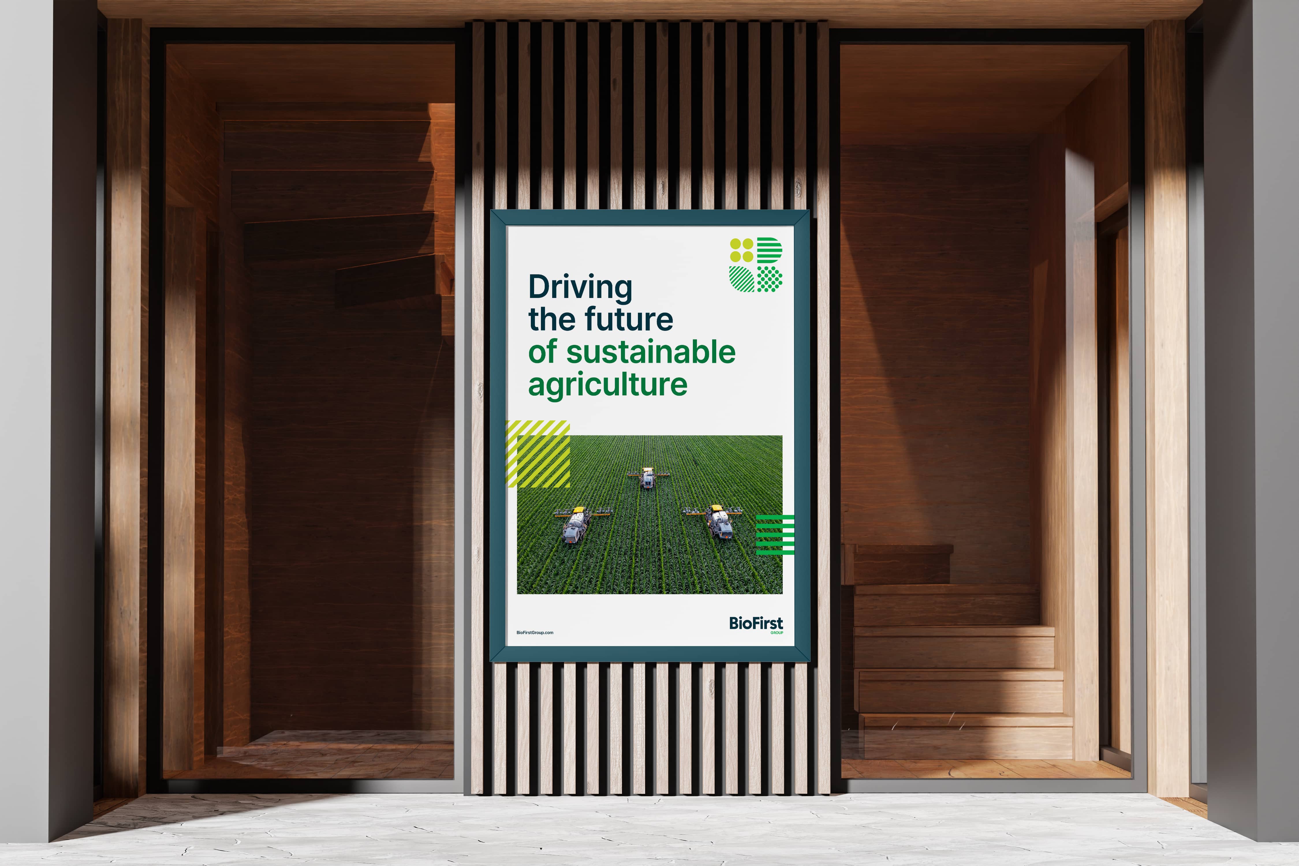
The identity draws from agriculture itself. The geometry of crops, fields and natural systems, structured yet organic. Four elements that reflect the group's divisions while embedding the letter B directly into the mark. A house of brands, clearly defined and intrinsically connected.


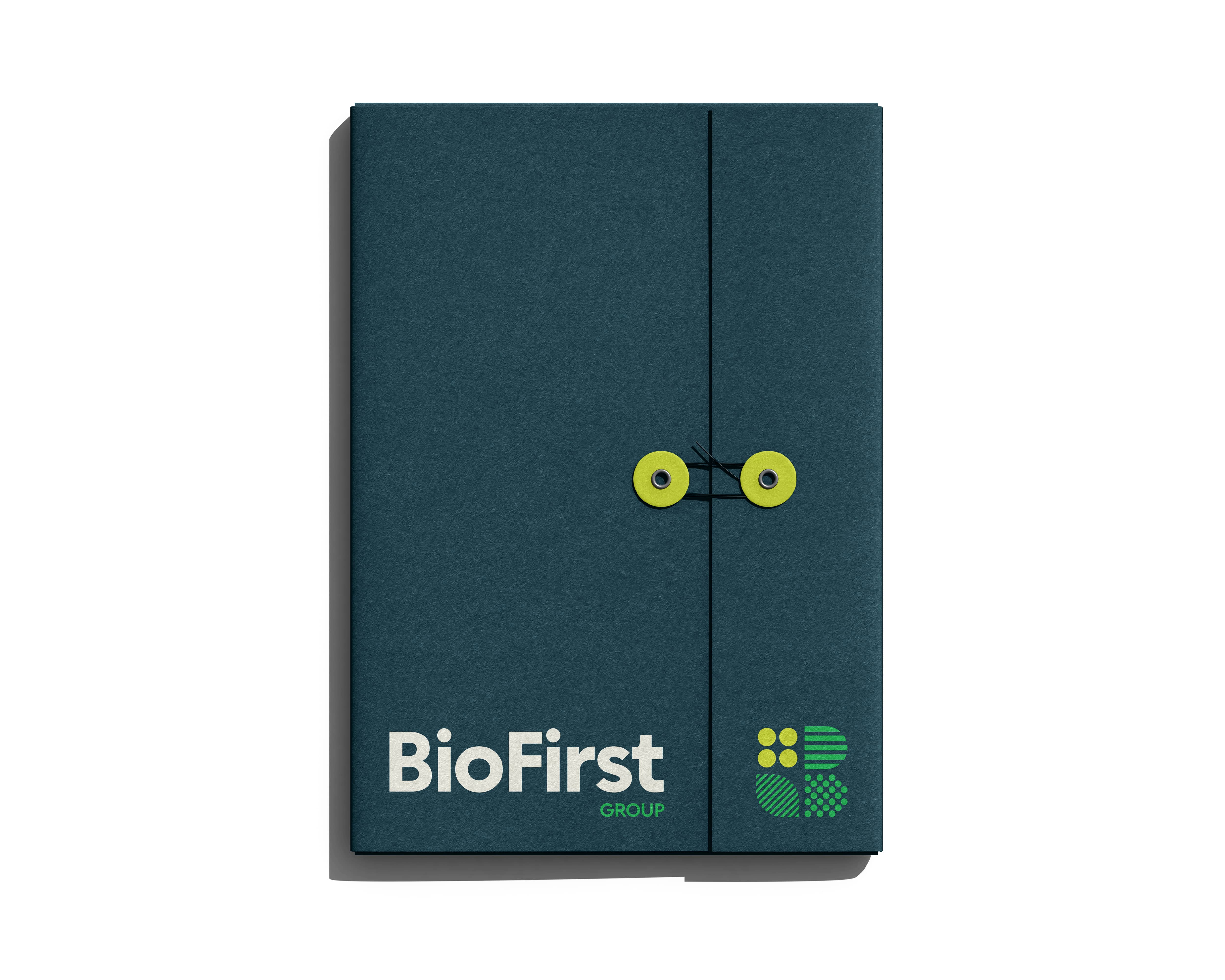
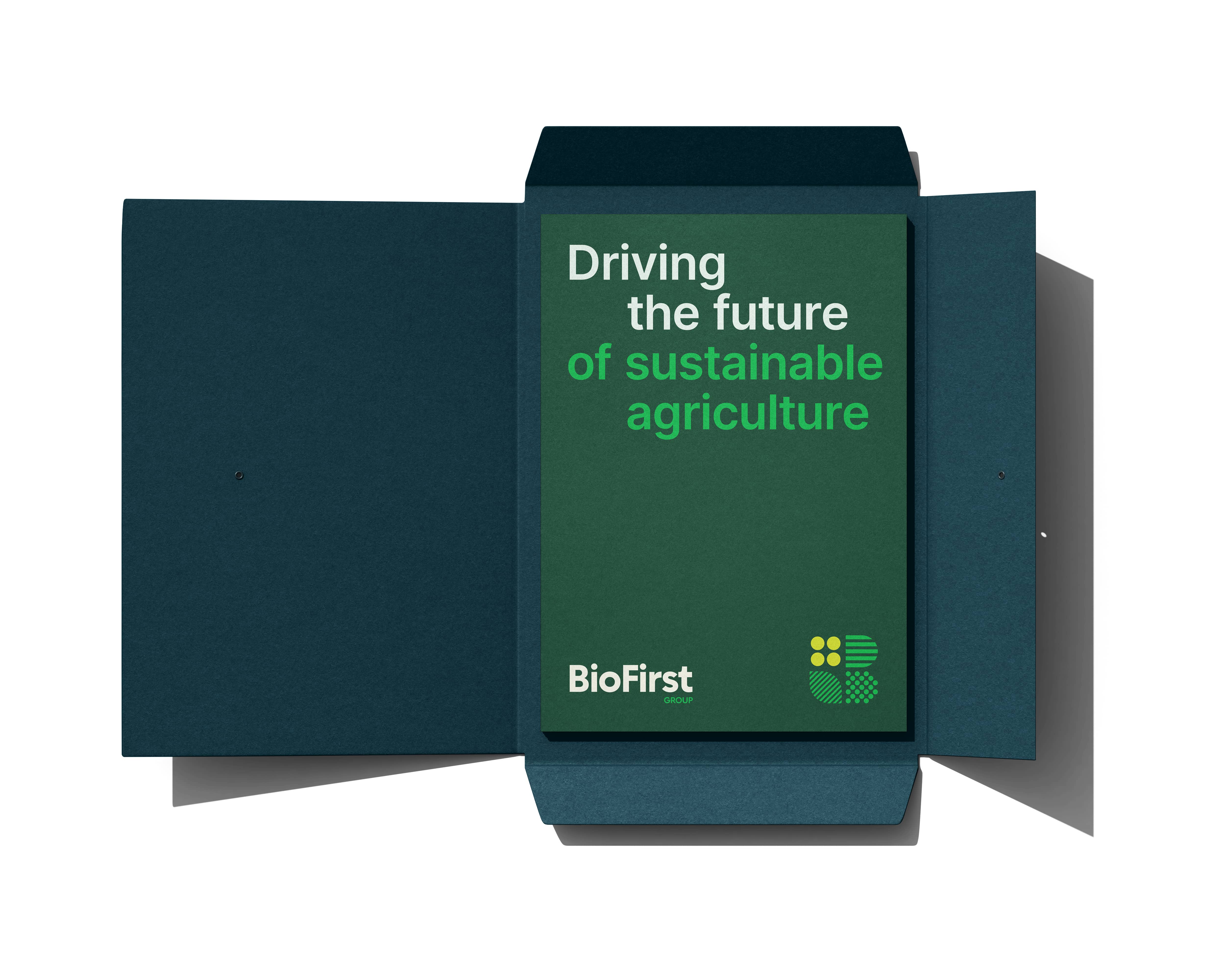
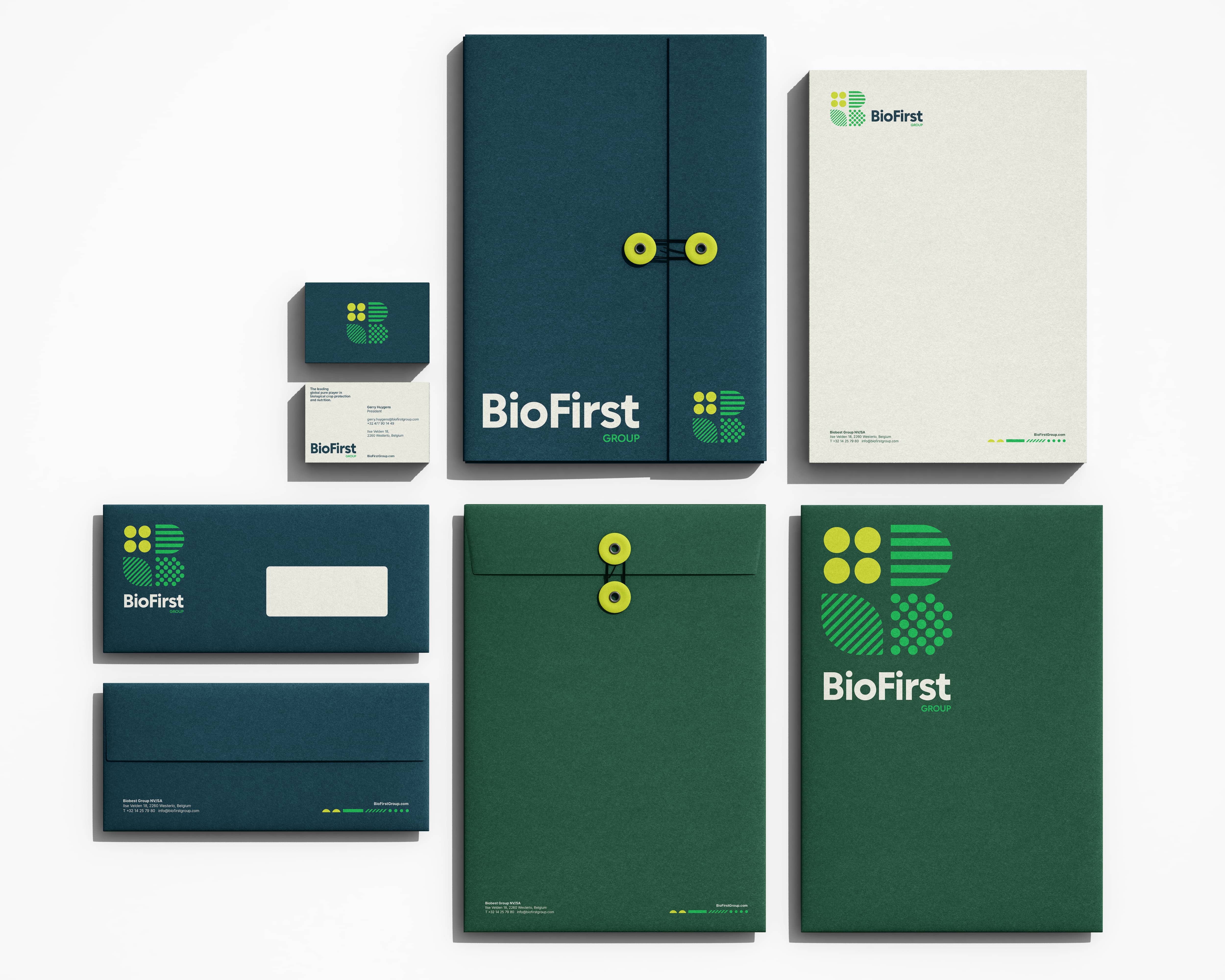
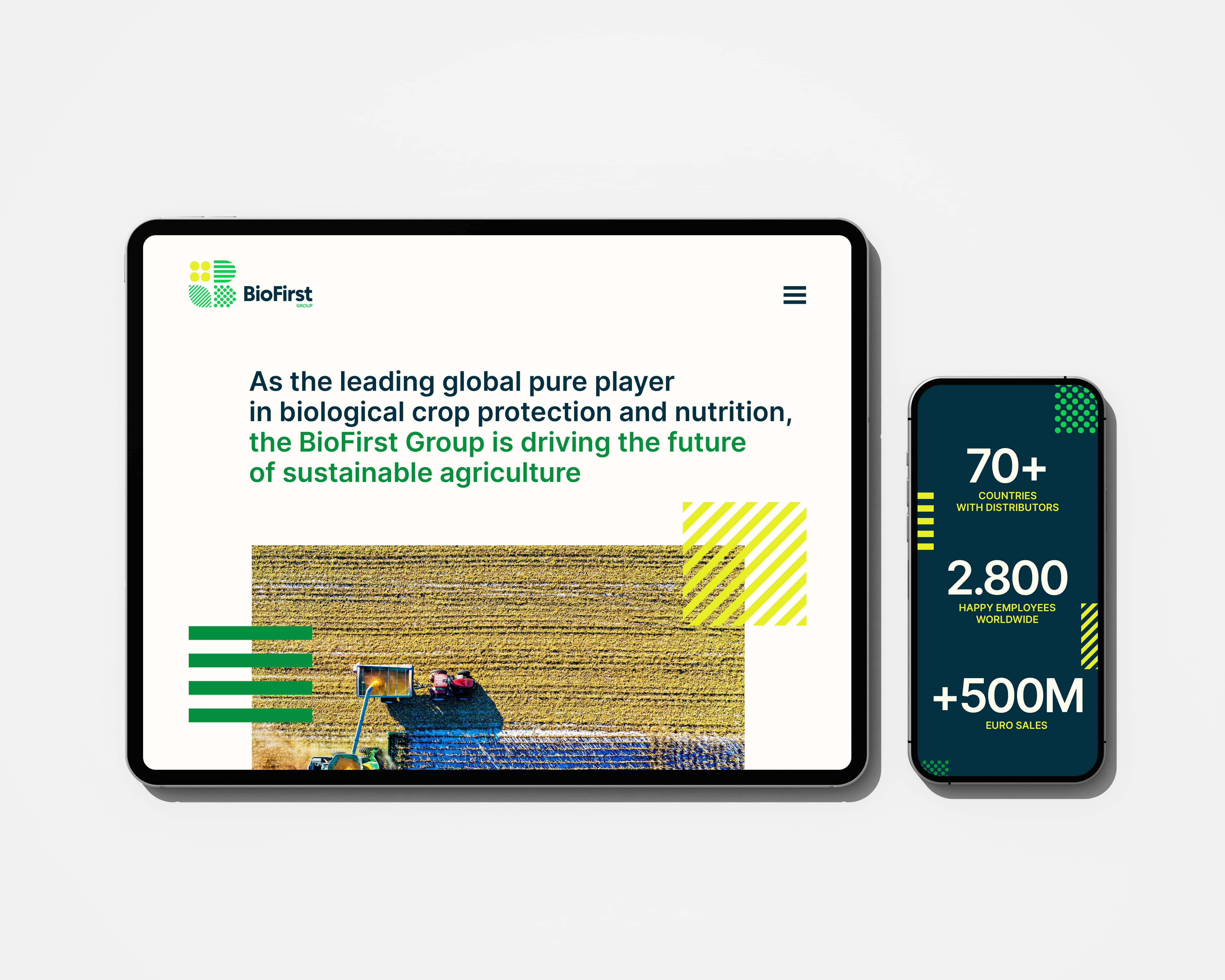
The color system balances earth and sky. Green and blue, nature and innovation. A brand that knows where it comes from and where it's going. Built to extend consistently across stationery, packaging, signage and digital. A system designed to scale with the company.
BioFirst launched its new identity across 70 countries. Within months, the brand was recognized at the Trends Impact Awards with both the Global Impact Award and the Impact Award for Ecology. A first expression that immediately read as a global leader.

BioFirst came to Kitchen at inception. No existing identity, no reference point, just a name and a global vision. What they built became the foundation for one of the world's leading sustainable agriculture groups, across 70 countries.
Jan Schoovaerts
Business Development Director IPM & Pollination