Curewiki
Making clinical trials more human
Curewiki partnered with Kitchen to define a brand for a new kind of clinical trial platform. Designed to connect patients directly with relevant studies, Curewiki shifts the model from research-led to patient-driven, making clinical trials more accessible, more understandable, and more human.

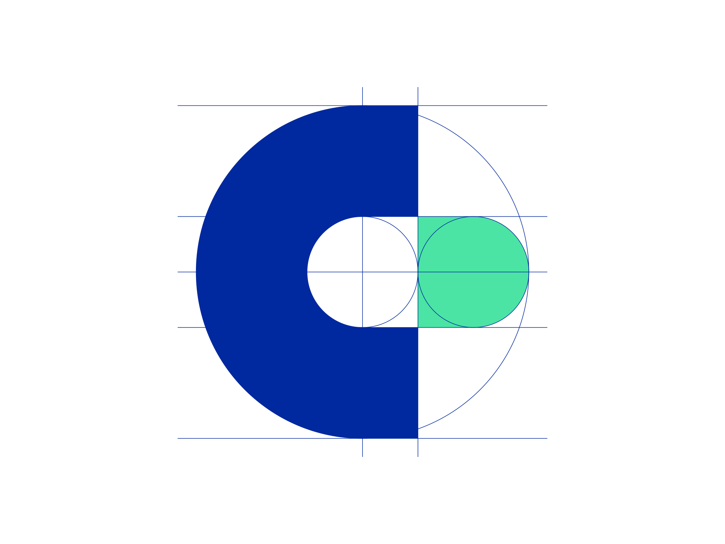
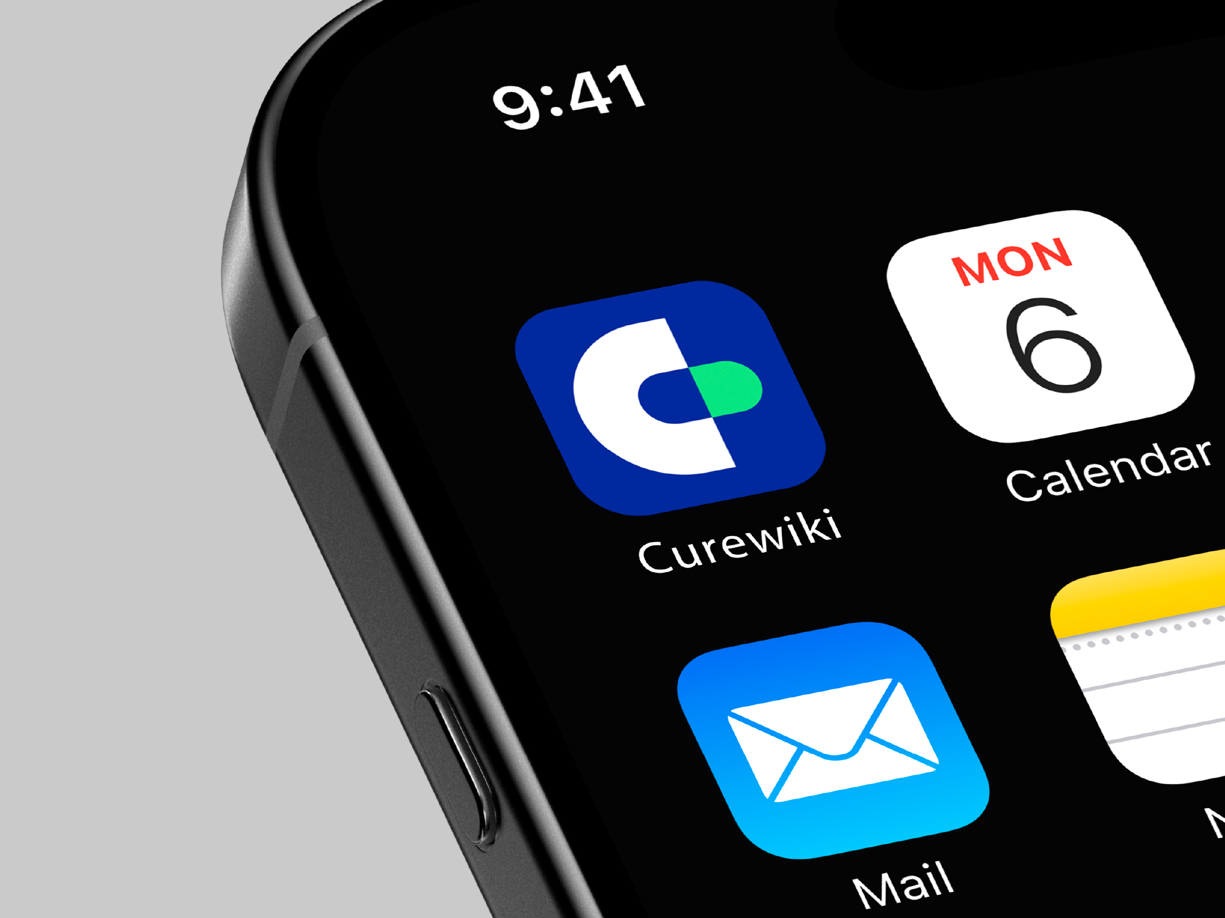
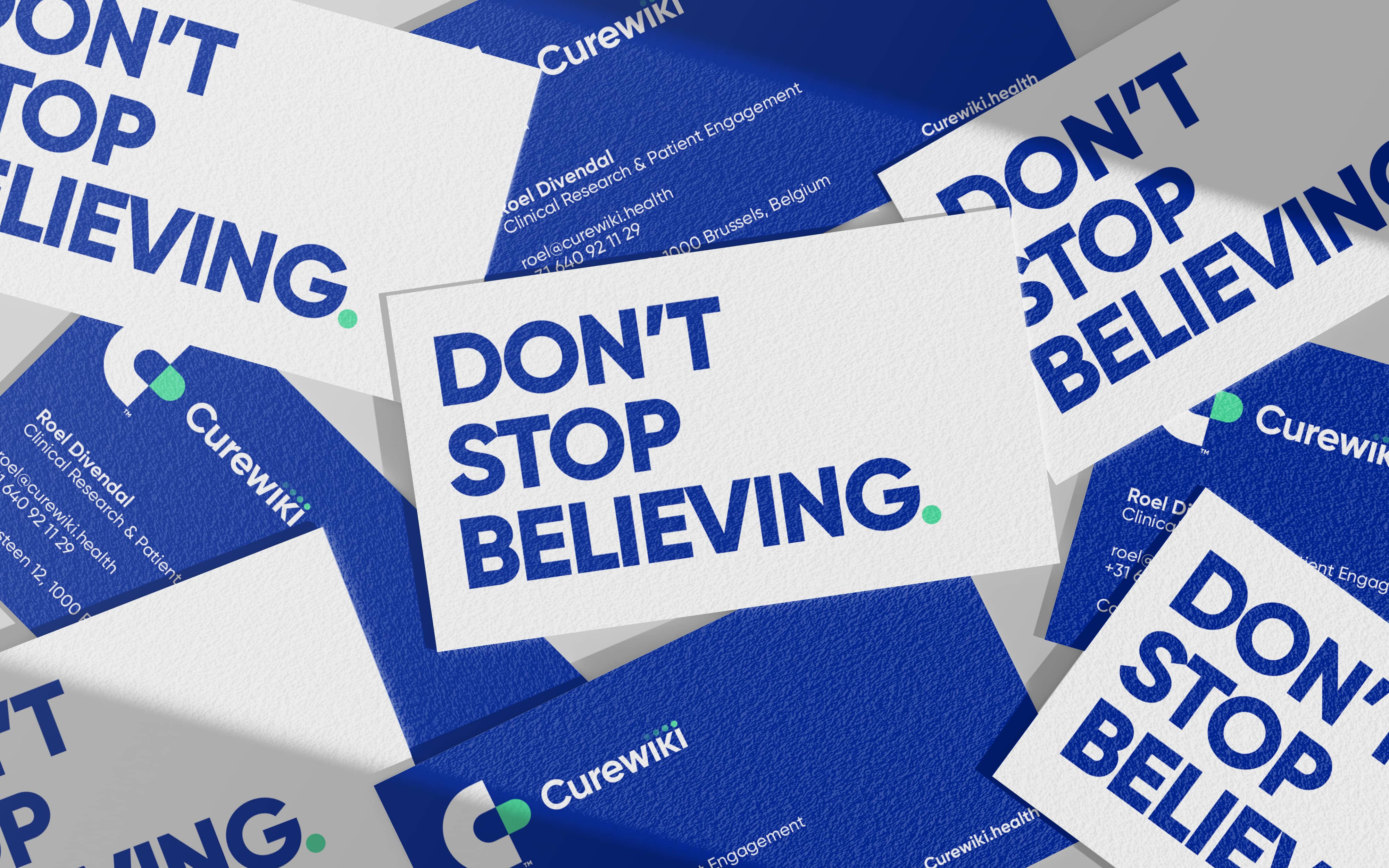
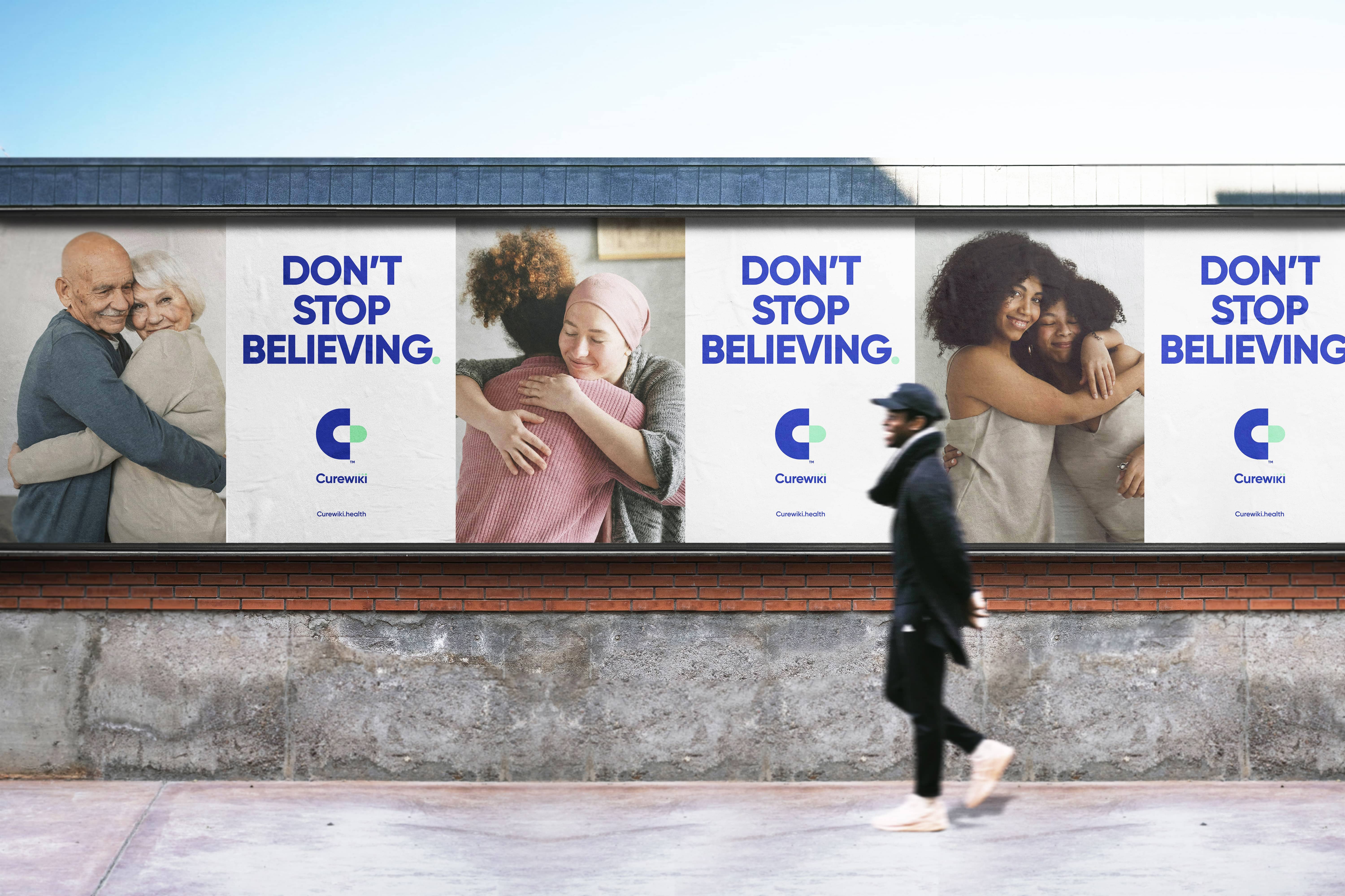
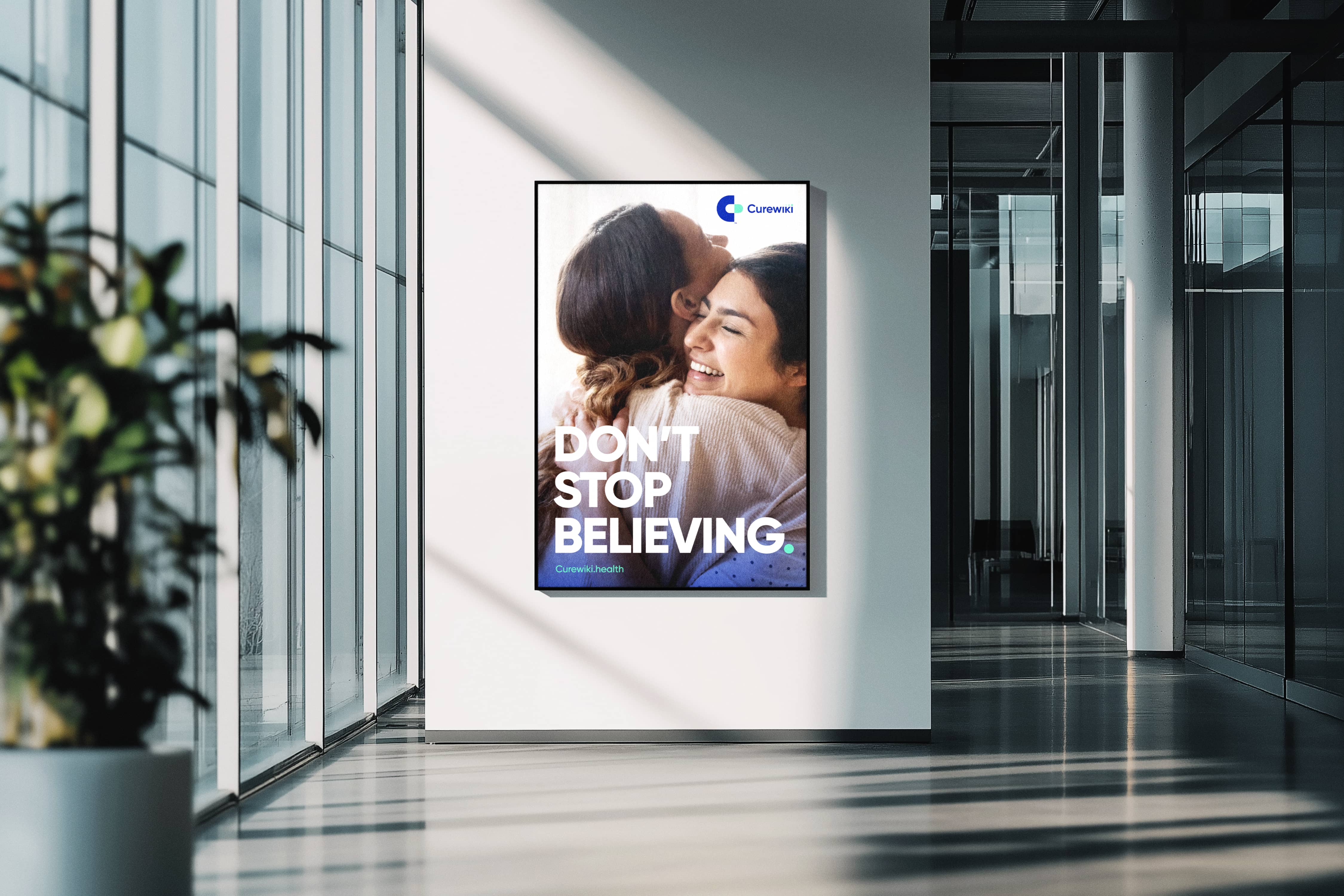
We translated this vision into a simple and recognizable identity. At the core sits a pill-shaped “C”, a universal gesture of care, treatment, and progress. Both symbolic and functional, it reflects Curewiki’s role as a bridge between patients and research. The design balances clarity and trust, speaking to both medical professionals and individuals navigating their own health journey.
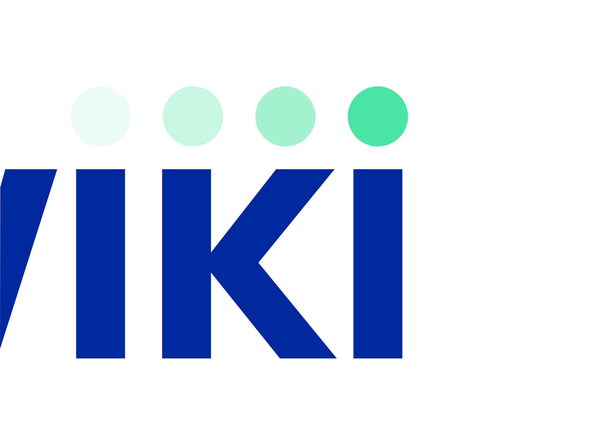
Subtle details reinforce the idea. A single dot, precise and intentional, signals movement and progress. A system built to feel accessible without losing credibility. Confident, but never clinical in a cold sense.
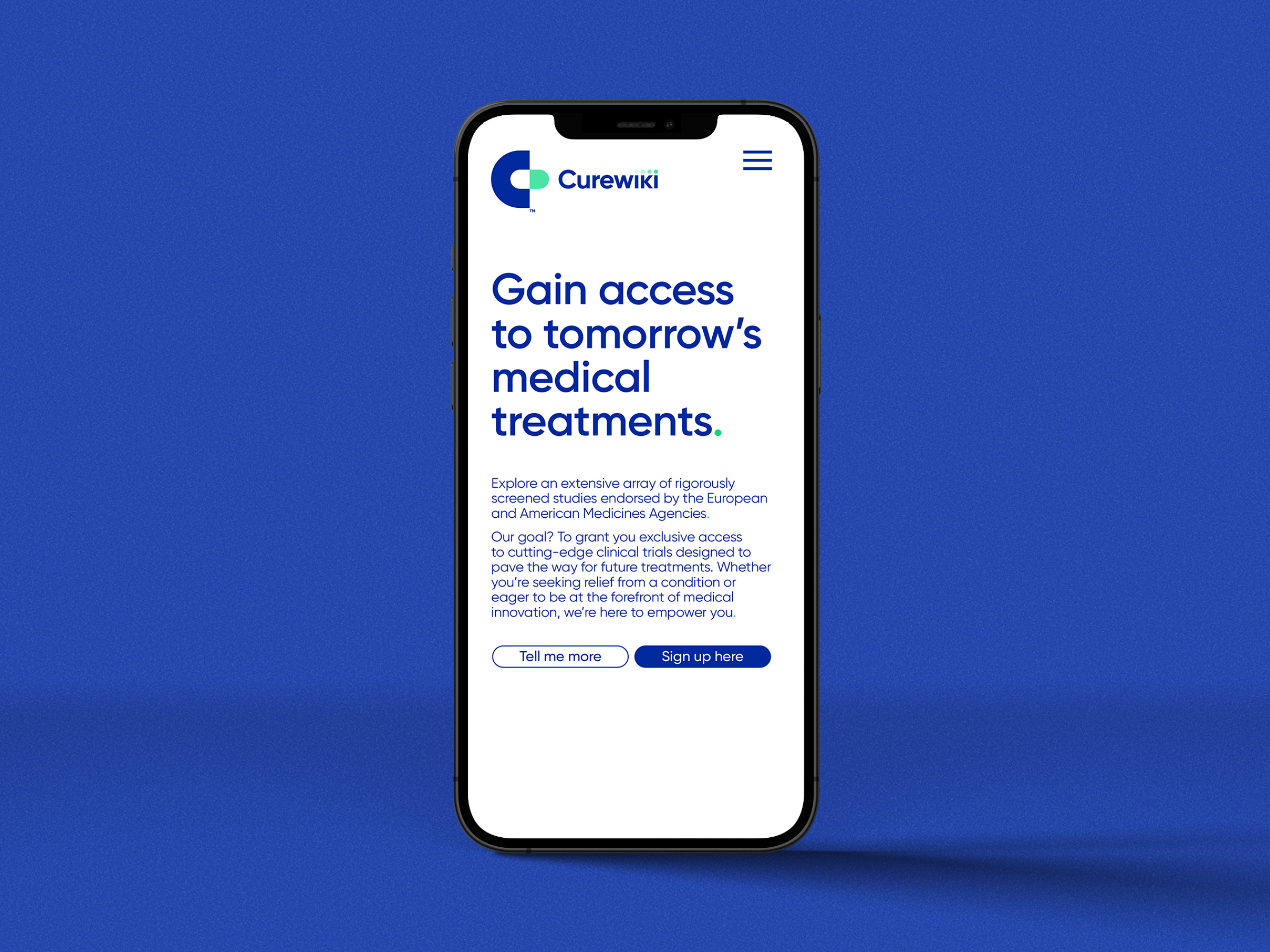
A brand that invites participation, builds trust, and opens the door to clinical research for those who need it most.

We needed an identity that made clinical trials feel accessible rather than intimidating. Kitchen understood that challenge immediately and built something that invites participation.
Jean-Sébastien Gosuin
Founder, Curewiki